This is a bit of a twist on the typical burndown chart with a couple of extra features:
- Velocity = points/actual hours. As the number of hours I work in a “sprint” can vary, and it is just me which gives a small sample group with a large degree of error I divide the points completed by the actual hours spent to date to get the velocity. I can then use the average number of hours a week I work to predict the delivery date. You could say I am working to a sprint of one hour!
- Dynamic trendlines. I use the Google Sheet’s trendline feature to dynamically predict when the actual completion date will be, plus another line to predict the completion date based on my initial estimate of the velocity.
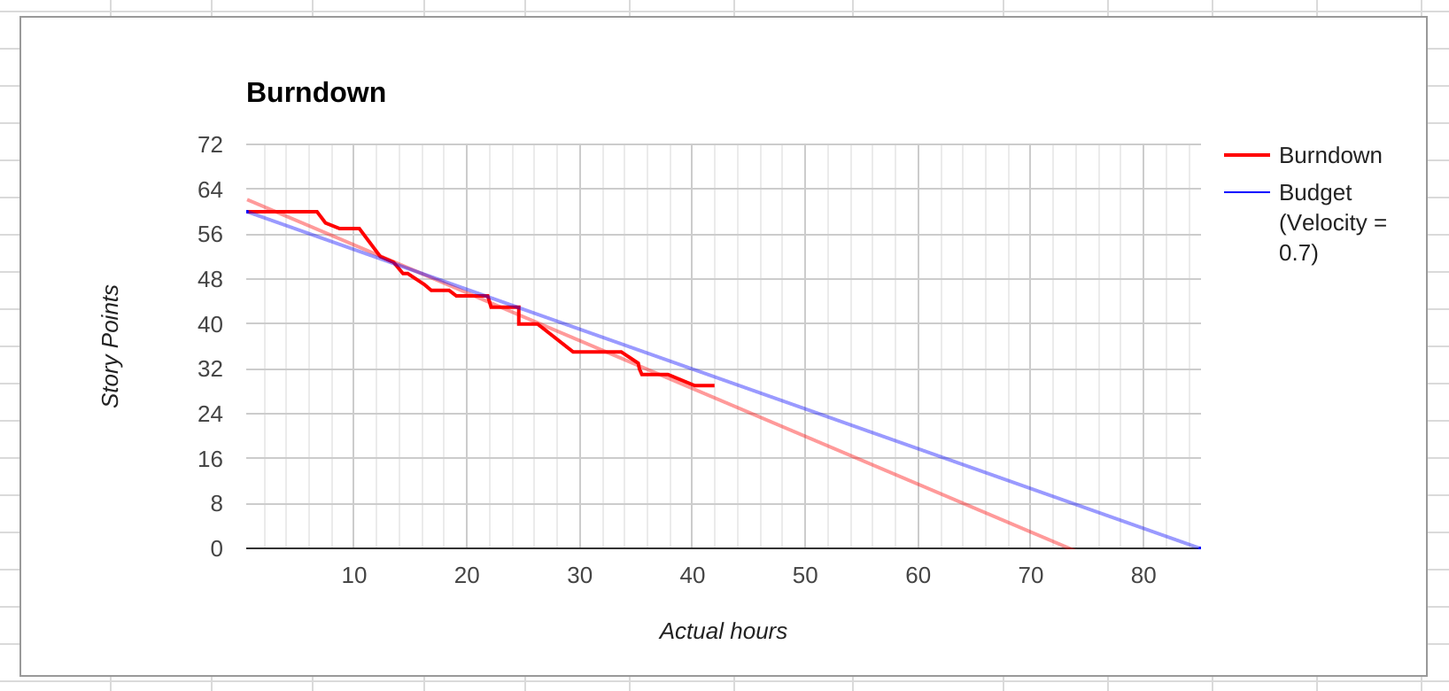
The demo time-sheet and burn-down chart is based on an actual project with a budget of 85 hours which is half way through. I had initially estimated a velocity of 0.7 (the requirements were very clear and we had worked together on another project), that is each point would “cost” 1.4 billable hours once all the non-coding tasks had been taken into account and we had enough data to calculate the relationship between points and actual hours. You can see the velocity is actually running at 0.74 but I would expect this to slow down as the owner starts testing the changes in earnest, and we make any updates and prepare it for deployment. Although the number of hours per week (my typical sprint) varies it averages out at 16 hours a week, which puts this project on course to take about five and a half weeks.
I use Trello cards to record the user stories and the Plus for Trello browser extension to assign a number of points to each feature or user story.
